Stress.

With only eight days left to hand in all my work and put up my exhibition i’m a little stressed. Real World was already completed as our group worked really well together so I am pleased with the level of work which was produced, I have done half of the research and development however need to complete it.

Penguin book cover and competitions are at similar-ish stages and I feel that they are in a fairly good place and simply need finishing up. The reasearch and development is 3/4 done for these projects they just need updating, so I feel quite confident with these two projects also.

For my exhibiton piece I am putting up the Big Idea for which I chose Eroticism, I feel that I am also in a good place with this project as I just need to do some photography and then I am ready for print which I hope to have printed or taken to the print shop by the weekend!

What i’m most worried about is my student set project as I really didn’t get on well with it and I have done the least for that project. However, i am hoping to finish all of the other projects within the next few days so that I can 100% concentrate on improving that project.

Here are a few screenshots with the work that I have been gettting on with:

A Clockwork Orange:

Screen Shot 2016-04-28 at 00.21.52

Big Idea: Eroticism

Sensory Erotic Experience

Competitions: Design Bridge

Screen Shot 2016-04-28 at 00.26.14


Second week of Penguin book covers

Unfortunately, the second week of Penguin I was ill all week so missed my tutorial but managed to come in on the Friday for a review of the book covers. I really felt as though the week didn’t go well, as due to being ill my ideas were not flowing at all and I didn’t feel as though I was progressing sufficiently enough. I ended up working on a second book cover as my original one wasn’t improving enough so I took my mind away from it. I wanted to consider a couple of types of mediums, so after working digitally on illustrator I hand drew the other design using my digital drawing pad to see which worked best. I really enjoyed hand-drawing the second idea and thought that the eye on the front worked however with feedback from Ian, he said that the idea as a whole didn’t work, which I understand. I went back to working on my initial idea and after some feedback via email I worked on it much better and finalised the piece for Friday. I can’t currently talk about my ideas or reasons behind it or show any images however I will add all of this once I have entered the Penguin book cover competitions.

On Friday the feedback was a lot more positive than I thought it would have been and I was really pleased! I was told that it was an interesting/unusual solution but I would have to amend a few things to make it a stronger piece. I will amend it over Christmas to make sure I boost my grade and improve the piece for the competition and my portfolio.

Penguin tutorial with Ian

I had a tutorial with Ian and presented him with all of my sketched ideas and my two strongest (roughly) digitalised pieces. I am pleased that Ian was most convinced by the piece that I felt most confident on developing further. Ian found it quite unusual and intriguing and I felt that it wasn’t too similar to previously done cliché designs which actually reflected the film more. From the piece that I showed at the tutorial it was recommended that I make the milk a lot more convincing and to also definitely consider how the front and back will work as a whole and not just to concentrate on the front, which I had foolishly been doing. I was advised to think about a design that would flow from the front onto the back which for me I really liked as I am using milk, so this could flow really nicely. I found this session really useful and it gave me a step in the right direction, it was also good to hear a few of the other tutees opinions and advice on my work, which I also take into consideration.

New project! Penguin Book Covers

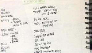
I wanted to get a head start on this project as it’s only two weeks long and I find the short time scale difficult last year! I decided to watch the film the night before starting the project and took some notes. I have already seen the film which is useful, as watching it a second time just reaffirmed it all for me. I picked out some key themes, styles and colours and drew up some very initial sketches. I’m excited for this book cover as it’s such a controversial film with a variety of themes.
12200418_10153599934726233_1587984943_n  12200937_10153599936216233_1956798604_n

In reflection on my book covers from last year, I need to be a lot more experimental this year! I think that the way in which I designed my Real World project work has set me up well for this penguin project as I experimented and used illustrator a lot more.

Penguin Book Covers

For this project we began by watching the three films necessary in order to design 2 of the 3 book covers. The three covers given to us for the penguin competitions were ‘Freakonomics’, ‘Carrie’s war’ and ‘Oranges are not the only fruit’. I began by brainstorming ideas for all three of them, as well as some initial sketches. Initially, I chose to design for ‘Oranges..’ and ‘Carrie’s war’ and worked on these right up until a few days before the deadline. ‘Carrie’s war’ wasn’t going how I wanted it to, so 2 days before the deadline I switched to ‘Freakonomics’. The two outcomes that I presented were not as good as I wanted them to be however I will amend them for the final competition entry. My ‘Oranges…’ outcome is a little provocative however I’ve used colour and themes to represent the sexual side as well as the pure religious aspect of it. My ‘Freakonomics’ book cover I’m a lot less happy with as I only had a couple of days to put the whole thing together. It currently looks a little bit too much like an ordinary economics book therefore I need to put a twist on it when I make amendments to them both.