Initial Ideas And Brand Values

Some of the ideas that I wanted to consider as part of my brand are: non-animal tested, natural ingredients (if you care about what goes into your body you should consider what you put on the outside of your body), sustainable, value for money, non-gender specific and a portrayal of confidence and honesty. I am primarily focusing on one of theme themes however other aspects will feature into the brand.

So I have come up with two ideas, however at this stage I can’t talk about them as they are for a competition. I will however be designing multiple products to ensure that I push myself to my capabilities. I’m quite pleased with the ideas that I have come up with however I struggled with coming up with a third one for our Friday tutorial.

I did a mind map of brand values for my idea as it’s very good to start with these to ensure that I work towards them and don’t lose sight of them. I have quite a lot of brand values at the moment however once I am set on a strong idea I will circle at least three of the most important values.

12283262_10153628321261233_105880749_n

Brand Research

To get an idea of what competition is already out there I started looking at gender neutral products and their principles, colour schemes and typefaces. I didn’t actually find that many which is quite good for me as it gives me more room to come up with a good idea that hasn’t been done to death.

One brand in particular I found interesting was Sam Farmer’s, who created a unisex range for adolescent skin and hair. As a parent he hated all of the gender stereotypical products that were pushed in his children’s faces. He created a face wash, shampoo, conditioner, body wash, moisturiser and deodorant, all of which also came in a travel size pack. His aim was ‘body washing, not brainwashing’ whereby he focused on the cosmetic science of it instead of marketing misinformation. It’s a very personal brand and the website itself tells us his name and number as he wants his brand to be clear and honest. I really like the whole meaning behind this brand and have found it very useful to look at..

Screen Shot 2015-11-21 at 17.03.15

I then considered colour and type but of course this is all still at a very early stage so these are subject to change, I just wanted to make sure that I am considering it as I go along. I am quite keen on using a mocha colour with a bright colour to compliment it!

Screen Shot 2015-11-21 at 17.02.44

Design Bridge Research

I find this brief really interesting as I have to create a beauty brand in response to some of the issues today, such as gender stereotypes, healthy body image, environmental concerns, or any other issues that I feel are relevant to users of beauty products today. The brand must be aimed at an audience of all gender identities, who want a forward-thinking beauty brand that reflects what matters to them most.

I began by thoroughly reading the brief and breaking it down into important sections, this ensured that I fully understood what I was being asked to do.

12076880_10153628322381233_1809802881_n

Once I had this sorted I started by gathering some primary research to begin my research process, so I created an online questionnaire. It really helped my to find out which products men found feminine to use and which products women found masculine to use. This research will definitely be made use of in regards to the end product that I create and brand.

(Insert Imagery Here)


New Project – Competitions

So we have started our final project before christmas which is ‘competitions’ and I looked at the YCN and D&AD competitions. I am really excited to tackle this brief as there were so many great briefs to choose from. I managed to cut it down to 11 but found it so hard to pick just one. I ended up with four briefs from D&AD and three from YCN but with help from my tutor I narrowed it down to just four and then was told that picking one from D&AD would be advisable due to how well recognised an award is from them. I would say that I was generally interested in the branding and advertising briefs and had ruled out any which involved animation. I really don’t want to do any moving imagery this year as I find that it is my weakness and I really don’t want to bring my grade down this year. I also feel as though I haven’t just avoided moving imagery as I have done it in both first and second year. So i found my tutorial with Ian really useful as we have narrowed it down to the ‘Design Bridge’ brief, it is a very full on and involved choice but it will give me the opportunity to be creative, explorative and give me access to showing my full potential. I am happy with this choice and think it will be a real challenge!


Chapter one

Since being back at uni I have read Otto Neurath’s ‘International Picture Language’, Ellen Lupton’s ‘Reading Isotope’ and some of Dario Gamboni’s ‘Potential Images’. The first two books are what I used to form the chapter 1 of my dissertation, with my new question “:) Is this a face/this is not a face”. I haven’t quite fully decided on how to word my title, I am stuck between the two options that I have just written above. I have found it rather difficult to balance my subject and dissertation work and feel that my dissertation has suffered slightly. I only managed to submit 1650 words for the first submission but that is my whole chapter one. I am enjoying working on this question a lot more than the question I was initially working on and I believe in what I am writing.

I have been finding the dissertation tutorials useful and I aim to attend every single one as I feel that you can never have too much support. Last session I had several questions such as: Do we need primary research? Can I have some more information on lit reviews? And which person do I write in? All of this was answered for me. My tutor also advised me on how to approach my lit review for Chapter 1 with the use of Ellen Lupton’s analysis on the Isotype. I feel quite please with what I have currently written and now feel ready to start chapter two, whilst waiting upon feedback. I do really need to get a move on with writing the dissertation now though! I’d like to submit all of the main chapters by the end of term..

Second week of Penguin book covers

Unfortunately, the second week of Penguin I was ill all week so missed my tutorial but managed to come in on the Friday for a review of the book covers. I really felt as though the week didn’t go well, as due to being ill my ideas were not flowing at all and I didn’t feel as though I was progressing sufficiently enough. I ended up working on a second book cover as my original one wasn’t improving enough so I took my mind away from it. I wanted to consider a couple of types of mediums, so after working digitally on illustrator I hand drew the other design using my digital drawing pad to see which worked best. I really enjoyed hand-drawing the second idea and thought that the eye on the front worked however with feedback from Ian, he said that the idea as a whole didn’t work, which I understand. I went back to working on my initial idea and after some feedback via email I worked on it much better and finalised the piece for Friday. I can’t currently talk about my ideas or reasons behind it or show any images however I will add all of this once I have entered the Penguin book cover competitions.

On Friday the feedback was a lot more positive than I thought it would have been and I was really pleased! I was told that it was an interesting/unusual solution but I would have to amend a few things to make it a stronger piece. I will amend it over Christmas to make sure I boost my grade and improve the piece for the competition and my portfolio.

Penguin tutorial with Ian

I had a tutorial with Ian and presented him with all of my sketched ideas and my two strongest (roughly) digitalised pieces. I am pleased that Ian was most convinced by the piece that I felt most confident on developing further. Ian found it quite unusual and intriguing and I felt that it wasn’t too similar to previously done cliché designs which actually reflected the film more. From the piece that I showed at the tutorial it was recommended that I make the milk a lot more convincing and to also definitely consider how the front and back will work as a whole and not just to concentrate on the front, which I had foolishly been doing. I was advised to think about a design that would flow from the front onto the back which for me I really liked as I am using milk, so this could flow really nicely. I found this session really useful and it gave me a step in the right direction, it was also good to hear a few of the other tutees opinions and advice on my work, which I also take into consideration.

Developing and visualising rough ideas

So I chose two of my current preferred sketches and worked them up very roughly on illustrator to get a better idea of whether they could work or not. I annotated them to make sure that I had reasoning behind each of the visuals. I’m a little concerned that milk has been used a few times, however perhaps if I eradicate the glass itself with another source/object it will become more original. I’m quite happy with where I am at this stage and feel like I have explored/sketched quite a few options for my Friday tutorial. This project is a huge change to the last one (Real World) however I like the drastic change as it keeps it interesting and very varied. 
Screen Shot 2015-11-05 at 21.46.27
Screen Shot 2015-11-05 at 21.46.18

Revisiting the briefs

From the Penguin website:

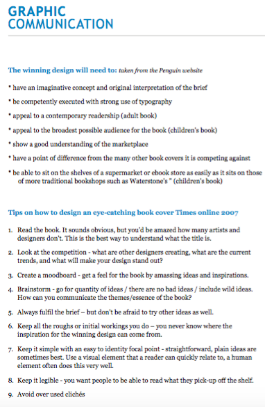
A Clockwork Orange by Anthony Burgess

The daring and electrifying book that inspired one of the most notorious films ever made.
‘What we were after was lashings of ultraviolence
In this nightmare vision of youth in revolt, fifteen-year-old Alex and his friends set out on a diabolical orgy of robbery, rape, torture and murder. Alex is jailed for his teenage delinquency and the State tries to reform him – but at what cost?
A dystopian horror, a black comedy, an exploration of choice, A Clockwork Orange is also a work of exuberant invention which created a new language for its characters.
‘Every generation should discover this book’ Time Out
‘Still delivers the shock of the new . . . a red streak of gleeful evil’ Martin Amis

The Brief

Clockwork Orange is as dazzling and inventive to new readers today as it was when it was first published half a century ago. The story is well known both in celluloid and print so it is essential to come at it from a fresh angle. Try to design a new cover for a new generation of readers, avoiding the obvious clichés. Originality is key.
Your cover design needs to include all the cover copy as supplied and be designed to the specified design template (B format, 198mm high x 129mm wide, spine width 10mm).

What the judges are looking for:

We are looking for a striking cover design that is well executed, has an imaginative concept and clearly places the book for its market. While all elements of the jacket need to work together as a cohesive whole, remember that the front cover must be effective on its own and be eye-catching within a crowded bookshop setting. It also needs to be able to work on screen for digital retailers such as Amazon.

Uni set brief:

Screen Shot 2015-11-05 at 00.12.40

I thought that it would be useful for me to revisit the brief and have a more analytical look through as I have lost sight of the brief in previous projects from first and second year, so I want to keep looking at it throughout the project. I have highlighted words that stood out to me in terms of stylistic approaches, what the judges are looking for and the specific brief itself. Pulling out these important words will be useful to me when considering potential designs for ‘A Clockwork Orange’.

Ideas and artist research

12202100_10153672911587622_1926972717_n 12208112_10153672911557622_269589997_n

I have sketched out some ideas based on the themes and icons that have stood out the most to me, such as, milk, mannequins, certain shapes such as triangles, the eye (less so) and colours such as white, red and black. At this stage I really feel as though my ideas are flowing but I think that I am working in a different way to last year as I have reflected on the mistakes that I made. I started by drawing up three ideas and I have continued to sketch out more and more ideas so that I don’t just get fixated on my first idea like usual and cease to explore anymore options. The book was written in the 60s and the film was produced in the 70s so I wanted to look at 60s styles and patterns as this was something that I picked up on in the film. I personally feel that these patterns could be related to the drugs found in the milk in the twisted version of the Korova Milk Bar, I really don’t want to stick to the colour orange. I think these patters could also reflect the twisted yet vibrant/exaggerated violence because of the colours and contorted shapes.

Screen Shot 2015-11-04 at 20.40.01Screen Shot 2015-11-04 at 20.40.29Screen Shot 2015-11-04 at 20.40.14 Screen Shot 2015-11-04 at 20.40.11

I went on to do some artist research just while I had the mannequins in mind as an idea as they really stuck out to me.

Allen Jones:

Screen Shot 2015-11-04 at 23.15.23  Screen Shot 2015-11-04 at 23.15.10
Screen Shot 2015-11-04 at 23.15.08Screen Shot 2015-11-04 at 23.15.15

I really liked what the artist did with these mannequins, especially as it reminded me of the clockwork orange film. The female form being used an object which is how its represented in the film (used as a milk supply and as an object of rape). I’m slightly concerned that the cover can’t be too explicit even though the film is very explicit and disturbing. I think that making my research as broad as possible is best at this stage as I don’t want to filter it down too much.

Other images:

Screen Shot 2015-11-04 at 23.18.29 Screen Shot 2015-11-04 at 23.18.17 Screen Shot 2015-11-04 at 23.18.14Screen Shot 2015-11-04 at 21.46.55Screen Shot 2015-11-04 at 21.51.48