2nd Brief-Word

This next brief was moving on from image and was all about typography.
So what is typography?
I could be the management of letters, a means by which an idea is written and given visual form or simply just painting with words. There are a multitude of ways in which people define what typography is.
The advances in politics, economics, society and technology has helped typography to evolved but ‘Cunieform’ script is one of the earliest known ways of writing, made with wedge-shaped marks on clay tablets. Also, different art movements had different typography characteristics, for example, Art Nouveau used flowing forms and handmade letters, Dadaism used mostly Sans Serif and contemporary work is all about vast experimentation.

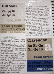
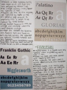
Once establishing what Typography is I looked at the history of 4 typefaces: Gill, Clarendon, Palatino and Franklin. Here is what I found and learnt:

2013-11-26 22.15.052013-11-26 22.15.46

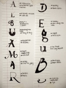
Next I looked at letter spacing and how words/sentences should be laid out to ensure smooth reading. I had to ensure an overall balance whether nothing jumps out and is distracting.

2013-11-26 22.20.01

Once looking at letter positioning and the history of 4 typefaces I experimented with those typefaces to create some ‘interesting’ layouts to help go towards a poster of one of them. Altogether there were 32 squares, here are just a few of them:

Untitled-1

Untitled-2

Initially I thought this would be a lengthy process however I think it really helped me to realise how much you could experiment with just one letter and the variety of different ways you could represent it. I think some of my outcomes are successful however I think I could have played it less safe and really pushed it further, for example cutting letters up perhaps!

Next we moved onto Expressive Personality Typography. My partner for this exercise was a girl from the 3rd year called Sun. I learnt that she was from South Korea, she studied business, she also studied interior design in Paris for seven years, she like reading, drawing, story writing and doing yoga and is 25 years old. From this the words I gathered to describe her were Cultural, Calm and Competent. These are some initial experimental ideas I did:

Untitled-3

For these I tried using biro pen, ink and charcoal as well as different techniques such as blending, daubing and using repeated lines. I felt that the outcome didn’t need to be too bold as I said she was calm, is need to be quite flowing to show her capability and there needed to be some sort of contrast to show her interest in different cultures (travelling). My best outcome was this:

2013-11-26 22.57.34

 I found this outcome the most visually interesting however i’m not sure if it represented my parter as well as it should have. I’m happy that I presented it vertically instead of typically horizontally as I think it helped to stand out a little more and i’m happy with the blending and the shape of the cut off letters. Unfortunately I feel that it doesn’t quite fit Sun’s character, which I think my lecturers would agree. I think that the contrast within the blending manages to represent the cultural side of her and her interest for travelling around. Also, the smooth brush strokes reflect her calm personality. Even though I liked the unfinished letters I don’t think this helps to show that she is competent and think it may in fact imply that she is forgetful perhaps. Finally I think that the letter edges could be a little too harsh as she enjoys calmer, more relaxing past times such as reading and yoga, maybe a softer or curlier touch may have implied this more clearly. I feel that if I had experimented further with my previous designs above and had had more options to choose from it would have helped me to decide on a better outcome.

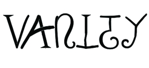
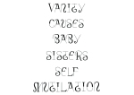
The next part of this project was to create a Hybrid Font, so I began by choosing a significant story that happened in my childhood. I came up with ‘Vanity causes baby sister’s self mutilation’. This came about from when my sister and I were younger playing in the bathroom together. I was looking in the mirror when my mum came in to find my sister’s face covered in blood! She had mistakenly shaven her face with mum’s razor…and still has small scars on her nose and cheek. Looking back now the story is quite funny however the written down now it also sounds quite dark/serious therefore it becomes more ironic. I aimed to use a more playful typeface to contrast the seriousness and to insure the viewers realise that there is a twist and it isn’t horrific.

I began by experimenting with typefaces in magazines and cutting up and matching various letters:

2013-11-26 23.02.37

I found doing this by hand and having to look for different typefaces in a magazine a pretty good way to start experimenting as I had to think quite carefully about sizes and which would fit together well. Of course some worked better than others! The two I particularly liked were ‘M’ and ‘R’. I managed to get the sizes pretty similar and they fit just right. The M was very flowing and the curl could possibly fit my story to create the irony of the sinister story. However I also like the really strong contrast on the R as it could represent the fun and sinister side all in one.

As I wanted my final outcome to be digitally done I moved on to experimenting digitally. I chose to apply different typefaces to just one word to start with:

Typeface Ideas2

I think apart from the ‘I’ and the ‘Y’ they worked ok.. however none of them were quite right yet. I think that for my story the curly serif fonts would work well however I don’t think there was enough contrast between any of the typefaces yet.

5

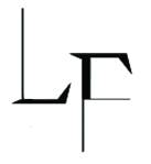
This ‘LF’ example shows that i’m beginning to get further towards what I feel my outcome should be like. I decided to definitely use a sans-serif and serif font to keep the contrast strong. However this is still implying that it is just a sinister story as the serif font is too sharp and jagged. I decided to use the sans serif font but introduce something else more playful.

Here are the layout options of my final outcome:

Layout1Layout2 Layout3 Layout4

I found that because most of the words were quite long not many words fit onto a line so laying it out landscape worked best.

Final Outcome
Layout4

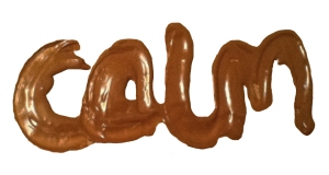
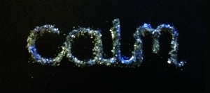
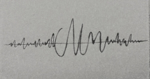
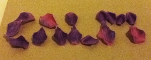
Words in the environment was the final part of this project. I was given the words ‘Calm and Storm’ and was asked to use the environment to express them. I wanted to think a little further than the obvious, such as candles reflecting CALM. I came up with various ideas for calm: glitter, music, chocolate, tea leaves, reading, rose petals and sand. On the other hand I came up with: crushed ice, makeup on the mirror, condensation, fire, smashed china, leaf rubbings and sand for STORM.

Here are some of my outcomes:

ChocCalm GlitterCalm MusicCalm PetalsCalm

MosaicStormIceStormLipstickStorm

These are experimental outcomes therefore don’t look as finalised as final outcomes. However I feel that it helped me to look closer at the beauty in my environment and how I could use it to express my graphics work, not just for this but for future work. I think they all worked quite well however the ‘coloured crushed ice’ to reflect storm didn’t turn out quite as I wanted as the ice began to melt, so unfortunately it looks a bit like jelly or sweets.

I really enjoyed working on this ‘word’ brief as I feel we got to experiment and learn about lots of different aspects of typography. Using typography to express someones personality and cutting up different letters to create new personal typefaces was another interesting insight into what more I could do with typography.
7th Constellation

This was the first lecture that I found really confusing and unfortunately didn’t take as much from, unlike the others.

  • I learnt the very precise meanings of ‘literal’ and ‘phenomenal’.
  • I learnt that there should never be limits in art and design, it should be free.
  • I learnt that throughout our life we gain experience therefore we enhance our creative minds over time, this defines what we think is literal and phenomenal.

7th Constellation-Dr Mahnaz Shah: The literal and phenomenal in art and design

The literal and phenomenal in art and design.

-We need to be conceptual (relating to or based on mental concepts/concerned with the definitions or relations of the concepts of some field of enquiry rather than with the facts).

Literal

-True to fact, not exaggerated, actual/factual, literal description of conditions.
Is it possible to be literal? Is factual based on perception therefore does everyone see it differently?

Phenomenal

Philosophical studies of the structures of subjective experience and consciousness – Edmund Husserl (1859-1938) (“He was a German philosopher who established the field of phenomenology (Phenomenology is the philosophical study of the structures of subjective experience and consciousness”) ).

Boundaries

-They indicate limits, however they shouldn’t apply to the art and design world.
-The Kantian principle: thought can only advance by freeing itself from the shackles of its own subjective conditions – “Immanuel Kant was a German philosopher whose comprehensive and systematic work in epistemology (the theory of knowledge), ethics and aesthetics greatly influenced all subsequent philosophy”.

——

Creativity comes with experience, you define what becomes the literal and phenomenal.

Existentialism
-holds that the starting point of philosophical thinking must be the experiences of the individual
-visual perception is visual thinking and therefore a cognitive activity. Rudolf Arnheim (1904 – 2007).

First Brief – Image (Object) Part 2

The next brief was a follow up of the first ‘image’ brief. However there was a slight twist, we had to present something familiar within unfamiliar context. This part was no longer in pairs, so I chose not to use the caulking gun as my object. I started off by brainstorming my ideas as I find this useful to open my mind up and develop them further.

plan

The six main points I came up with were:

  • Clock (I thought of combining this with a cockerel as they are a natural alarm clock-this becomes a clockerel)
  • Lightbulb (I took this quite literally and switched the light bulb with a flower bulb as both produce something.. bulb->light and bulb ->flower)
  • Lipstick (I also took this literally as a lipstick should actually ‘stick’ your lips together)
  • Wallpaper (As people stick a variety of wallpapers to their home walls I though as newspaper was also a paper, this could be used instead as a play on words)
  • Pez sweet dispenser (Pez dispensers give children sweets but I thought in an adult world this could be like a self-medication dispenser)
  • Egg cup (Lastly an eggcup, if taken literally would actually mean a cup made out of egg).

I chose to take the eggcup idea further and develop it.

eggcupdev

I did some quick initial sketch ideas of cracked eggs as the cup with the egg as the saucer. I also brought in the teapot element but thought to include a chicken tea cosy or something similar to really draw in the ‘chicken and the egg’ theme also. I showed this to my teacher for approval of the idea, she said that the idea was good but she really wanted me to push it a lot further and experiment!

I went on to research some artists/designers that used eggs in their work. Dali was one of the artist I looked at:

Dali

Dali is an artist I have researched in the past therefore knew about his extensive use of eggs. I thought that researching his work would be relevant to this brief as the work we were to produce had a slight surrealist side to it. It appears that he uses a lot of cracked eggs to show some sort of ‘new life’ and a cracked egg producing something new is what I was incorporating into my work-it produced my new object in it’s new environment.

eggprocess

So I then experimented with making an actual cup made from egg but not digitally. I put two eggs in a cup and pushed down a cut plastic bottle just far enough so that it still had a base then taped it in place and left it in the freezer. I also took some photos of egg and cracked shell saucers to see which worked best.

Untitled-2

I found that the cracked shell worked best as it created the most contrast and found that the eggcup and egg saucer would be too much and too the same. I wanted to incorporate every aspect of the ‘egg’.

I came up with this outcome:
finalThis is the feedback I received:

“A nice/strange composition … I think it would be stronger if the image were cropped around the breakfast table, rather than a view of wider scene – other elements are a distracting…. and there’s lots to see (and understand) in the central / important area. Well done.”

I do agree with this – there is a lot happening on the table and I feel that I need to focus on that point more and neaten up some of the edges and smooth parts that join together. I’d also like to add a handle to the cup to make it more realistic. Hoping to make these changes over christmas!

I found this brief really interesting but it did take me quite a long time to think of an idea, which didn’t leave me with very much time to execute the project, therefore there are quite a few adjustments I need to make.

6th Constellation

I found this lecture really interesting as it kept my attention for the entire hour. I found that by her using quite a current topic (DocMarten fashion) to explain about cultural meanings, it made it more contemporary and gripping, especially as i’m also fairly interested in fashion as well.

I found it particularly fascinating that Doc Martens had different cultural connotations over different eras. That in the 50s elderly women wore them for comfort which shows that they were advertised for durability and practicality purposes. This is in complete contrast to how they were worn in the 60s, 70s and 80s, as they were used as a fashion statement as well as to show masculinity and aggression! This represents that they are initially a blank canvas and that the customisation of them reflects a different identity each time.

By linking this to my graphics and how I work it helps me to remember the baggage that comes with an artefact and that I should always look at the history of where it came from and how its connotations have developed. As well as looking at the history I must also consider its gender identity, its race and ethnic identity, its class, its sexual identity, its social and historical context (when it was produced and received) and its social and cultural context (where it was produced and received) when looking at an object, piece of graphics/artwork etc.

Image

6th Constellation-Cath Davies: Teenage Kicks, cultural approaches to Dr Martens boots

Identifying cultural approaches and their meanings

10 years ago Doc Martins would have been a lot less recognisable however as seen in magazines, the book is back! ImageThe cultural meanings here are mainly related to the book, not really talking about the design of the boot. The function today is mainly important/taken notice of by product designers.

Connotations that go with specific objects have changed over time. As Kopytoff said (1986) in his cultural biography of things – “they have an identity like us”.

The main points to identify cultural markers are:

  • Investigate its status within different periods and cultures
  • Investigate its production process – who made it, for what purpose?
  • What role has it played at different stages of its career?
  • Why has its usage changed over time? What are the contexts for this development?
  • What are the different connotations/associations that are attributed to the object?

Even though Doc Martens are now in vogue and that connotes fashion, they previously had other meanings linked to them.
In the 50s, DMs would not be seen in magazines which shows the development of them as they are now seen in Grazia magazine and Vogue.
They were originally created for work wear, for example, police officer and firemen boots.
In the 50s elderly women wore them for comfort therefore it shows that they were advertised for durability and practicality purposes.
Later on Doc Martens became an object of street style and were claimed by the youth. In the 60s this was big of the skinheads and mods. They were claimed by different types of people throughout the 60s (Punk/Ska revival), 70s (Punk/Ska revival), 80s (Goths) and 90s (Grunge and Britpop).
ImageIronically here, both the mods and the policeman are wearing DMs although for very different purposes. They both show different connotations as the police cannot modify their DM look however for the mods they are more a fashion/agressive statement.

Docs are also like a blank canvas. Their meanings change ‘How are you wearing them?!’

“What makes a style is the activity of stylisation – the active organisation of objects with activities and outlooks, which produce an organised group-identity”

Hall; Jefferson et al, 1975 .

These designs and modifications are happening beyond the companies, they are not advertised, they are a personal thing.
You can take something new or original but the newer meaning is affected by the context and the customisation of the item. For example, Doc Martens even connoted masculinity and aggression in some cases. However Morrissey was a good example to contradict this and show how DMs could be portrayed in another way.

The formation of customisation and identity is malleable, it is not fixed and you can be seen however you want to be!

“Identities are fluid, malleable, constructed and performed – not fixed and ‘essential’ ” (Hall, 1996) .

Self fashioning occurs visually:

“the now seemingly quaint idea that we are born and grow up within cultural traditions that we accept…is laid by the wayside…all of us get to pick and choose what we want to be and who we want to become” (Lynch, Strauss, 2007, p3) 

However there is a selection process. We don’t directly recreate a style from the past, we simply reference it! It’s about authenticity and individuality. Today its is heavily implied that we should be keeping up and customising everything. You buy things as a blank canvas and you remake it and make it your own.

Doc Martens were actually banned for a period of time in the 80s as they connoted that you were going to cause trouble. The boots were seen as weaponry as people wore them to feel ‘safe’.

“got detention after detention as I insisted on wearing them to school…it was 1978. I bought a pair of 8 hole oxbloods…gran thought I looked like a skinhead…Putting on my first pair and instantly feeling like a badass”. (Dr Martens, 2012)

ImageAlthough this is an advert for carpet the fashion statements plays a large role in this. The DM and dress combination is quite edgy, representing uniqueness, this is therefore showing juxtaposition.

REMEMBER the baggage that comes with an artefact-always look at the history of where is came from and how its connotations developed. ‘Doc Martens stand for originality’ – That’s what we’re being told in the current selling strategy.

Cultural Markers:

  • Investigate its status within different periods and cultures
  • Investigate its production process – who made it, for what purpose?
  • What role has it played at different stages of its career?
  • Why has its usage changed over time? What are the contexts for this development?
  • What are the different connotations/associations that are attributed to the object?

Also consider:

How does the object/image ‘speak’ (and what does it say) about:

Gender identities
Race and ethnic identities
Class
Sexual identities
Social and Historical context (when it was produced and received)
Social and Cultural context (where it was produced and received)

First Brief – Image (Object)

OUTLINE OF THE BRIEF:

  • Encourage an analytical approach to image making.
  • Introduce the practise of image making. 
  • Introduce techniques in photographic lighting and adobe illustrator/photoshop.
  • Design an images based schematic piece that describes the object in the terms form, material and function.
  • As well as information rich, the graphics should be visually interesting/beautiful.
  • The final piece must contain substantial Adobe Illustrator content. 

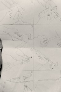
To begin with we were put in pairs and given a tool to work with, our tool was a Silicone (Caulking) gun. We began by drawing the tool from various different angles which I felt gave us a real initial feel for the object.

We then moved on to its function and the process of how its used and what it could be used for. These were just quick sketches so they weren’t expected to look too artistically perfect. I feel that I managed to show how to put it together and how to use it appropriately, quite simply and easily.
2013-09-23 19.57.18

All of this sketch work was helping us to get to an end result, which was to be a ‘manual-type’ layout on how to use the tool, how its made and what it’s used for. I then moved onto ways of presenting the object and what medias to use, I firstly tried biro and pencil. For shading purposes I found the biro too bold and a little scruffy. Perhaps some colour added to the pencil would highlight it enough.
DSC_0127

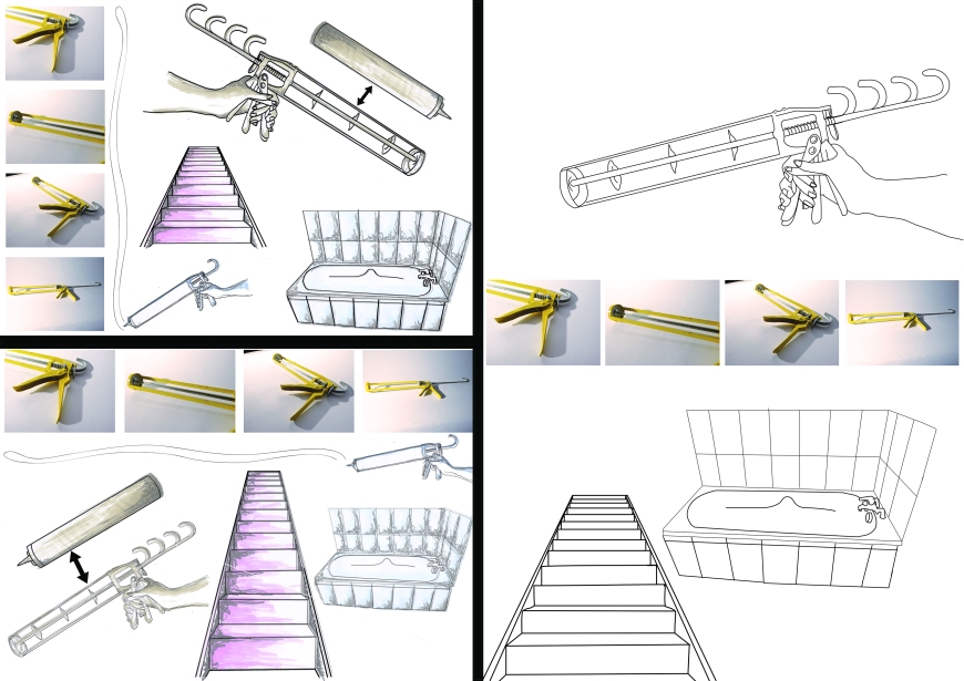
These are some of the developmental outcome ideas we came up with:

blogideasWith this object we found it quite difficult to lay it out neatly as it was quite an awkward shape. We tried to combine a variety of medias and used different coloured inks, paint and photography whilst still trying to ensure that it looks appropriate for a manual (straightforward).

From this we drew two outcomes:
1.finalfinal option2.final option
I found it quite hard to work in pairs as communication was sometimes difficult and we live far apart. I didn’t feel fully satisfied with the outcomes, especially number one. The feedback from number one that we received was that it wasn’t grid like enough therefore making it slightly too hard to follow and not ‘manual’ like enough. I think I will most likely redo this working as an individual to improve on this brief.

5th Constellation

This presentation was a panel discussion with questions to debate referring to all of the previous constellations.

Firstly I learnt that a possible option for my dissertation is a 15 minute presentation of my own 6000 word conference research paper (which would be recorded). There are also 4 other possibilities I will have the option to choose from later on.

The first question:

“we often think about making as making something new – an original design is a completely new solution to a problem; an original artwork opens up a new way go looking at the world – but is there also a historical component to making?”

The panel answered fairly similarly to this, I also agreed with their main points put across “As a society we put a premium on the new but how do you arrive at the new when you have to start from the old to arrive at the new. An interest in the new requires an interest in the old”.

The next question:

Who is right, Morris or Whistler? WM-“ Its not possible to dissociate art form morality, politics and religion” or JW “Art should be independent of all claptrap-should stand alone”..

I personally thought this was quite a complex question as I think both are very bold statements, I wouldn’t usually sit on the fence however I think the answer is somewhere between the two. I think it’s easy to be influence by what has happened throughout your life and what morals/opinions you have. However what if something is completely abstract? Is it completely abstract? Or does the emotion in it convey some sort of meaning, which would then again link more closely to WM’s quote.

The third and final question:

“How does technology influence making processes?”

From the panel there is a lot of information to back up that there wouldn’t be as much progress in art and design unless we had technology, e.g  “There are examples of artists begging scientists and engineers to create more tools for their work to progress”. However as i’m not a huge techno person myself I particularly liked the point made that “We tend to look at which is the driver and which is being dragged by the other but by taking a longer historical view the positions are often swapped!”

I found this panel discussion useful as it got me to really think about the art & design world and not just ‘what looks appealing’, especially as I usually have little interest in history in general, I found the development of art as a whole interesting and clever. Technology has hugely adapted the way we work however I personally like to do quite a lot of manual work, especially for experimental purposes.

4th Constellation

This presentation was on Sonic Arts.

I have previously studied music and played an instrument however this constellation was more about electronic music, the development of music and who influenced this. I learnt a lot from this and found a lot of the developing musical concepts very intriguing.

I was very interested in how Jon Cage (who I hadn’t previously heard of) had such a huge influence on music and its development. I also like how he was largely related to the arts as well, very relevant to me as I’m studying graphics. It also shows his adventurous mind and that he is willing to delve into more than one area which of course will enrich the creativity of the mind.

Jon Cage was very innovative as he explored the limits of music. He used unusual objects to create his music, such as ice cubes, rubber ducks and water pitchers among many others! This tells me that I need to be as inquisitive and experimental with my graphics work as possible to achieve more interesting outcomes.  I particularly liked what was said here “You don’t have to be an engineer to develop your ideas, all you need is creativity”.

I learnt that sonic art generally means the art form in which sound is its basic unit. It is associated with fine/new media artists as well as musicians. Some examples of the relations are:
Additive synthesis is like put a brick wall together
Subtractive synthesis is like chipping away at a sculpture
Synthesis by distortion is like making a clay pot on a wheel (stretching sound).

Image


3rd Constellation

This constellation was predominantly about William Morris and his influences on people and art. I have previously done some work on him however there was a lot more content within this presentation.

From this, it seems to me that William Morris’ work and ideas have never gone away, they are still highly influential and relevant today. It appears that he liked to convey messages, some political within his work. He also quoted that “Its not possible to dissociate art from morality, politics and religion” – I do somewhat agree with this as I feel that your experiences and views on life can influence how you produce your work.

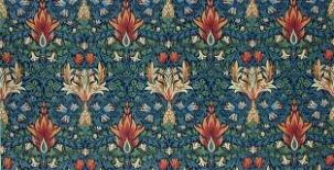
I chose to look at some more of William Morris’ work:
ImageImageImage

I really love his use of colour in his pattern work, such strong colours but they work so complimentarily. I think his work could link in quite well to the ‘book making’ brief that i’m currently doing as I will want a theme, image or pattern to illustrate the book with. Also as the story will most likely affect the illustrations this links in quite well with how his external influences affect his work!

Image