VIVA VOCE Reflective Questions

How did the choices of projects you made, help you plan for the future?

Towards the end of the year I started using photography, which I originally felt reluctant about because I didn’t feel confident in it however I feel that the photography that I did enhanced my projects after I went back and improved them. I think I would like to buy a good camera and develop the skill more to use within future projects. I feel that the choice to not use animation or film has confirmed that I don’t plan to work with them any time soon as I feel as though my projects have been stronger this year from last year. The choices I made in SSP, creating a hypothetical Fairtrade, natural and organic brand to design for have made me consider whether there are more sustainable companies to work for.

I do plan to work within design in the future and I feel that the array of projects I have completed have encouraged me to keep open minded and have ensured that I don’t eliminate ways of working in which I don’t feel comfortable with my skill levels. After university I plan to continue practicing in areas of working which I feel less comfortable in.

Which piece of work or project best represents your ambition? Why?

I don’t feel that any one project best represents my ambition. I don’t have a specific ambition within design work. I know what I am less keen to aim or work for but at the moment I am still open to most areas of design work. If I had to pick, I feel that real world best represents some of my ambition because I worked really well in a group and I hope, at some point, to work in a friendly small graphic design company, similar to when I did work experience. Working with at least one more person can really develop and push ideas forward which helps to see things in different lights and take briefs even further.

Which is the most memorable, interesting idea in your work?

I feel that the contrast and juxtapositioning within my big idea piece made sure that I communicated eroticism in a different light and answered the brief. I really feel that this project has made me realise that this could be applied to many future briefs and has helped me to consider designing things in different non-typical ways.

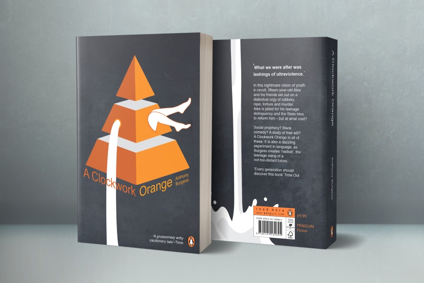
I also feel that the texture photography that I did was interesting for my work, with the ink in milk and the lilies. I feel very pleased with the way the photography turned out and think they look strong and bold, memorable to me because they are also something that turned out well that I originally doubted.

Which is your most appropriate solution to a communication problem?

Real World was a good challenge, especially as it was a live brief, to finding one of the most appropriate solutions to a communication problem. Rhodri, at the time, didn’t have a huge amount of participants on his training problem so that was a large problem that we had to tackle.  We created an innovative and exciting campaign to raise awareness and increase participation in the Cynnal Cymru training programme. We designed an animation, a website, business cards and an infographic with a more fun feel to engage and hold people’s attention, developing on their more serious and minimal design. They also didn’t have specific way of communicating the training programme very much, which we completely changed.

Give an example of work formed or influenced by your research, by your dissertation topic, and/or contemporary culture.

Big Idea is most probably the project which was influenced the most by research and my dissertation topic. Obviously we had to do extensive research for this project to see how our word was already represented and so how we could show it differently. My dissertation was also influential as it was based around perception and how people perceive the same things differently, and whether the intended message can ever be 100% interpreted as it is intended to be. This is why I represented the most part of eroticism via writing as it is more personal. My piece is simply suggestive therefore it can be interpreted and imagined depending on how each individual perceives it, leaving it open for each person to read as erotically as their mind wishes.

Exhibition! (Excuse the creases)

This slideshow requires JavaScript.

These are the calculations to work out how to put up my exhibition as perfectly as possible. I’m so glad that I went in on Thursday to start putting it up as setting a mock up took much longer than I predicted. On Friday I just had to put up my finals where I had marked them.

Final Exhibition:

13180883_10154124747682622_137616048_n

Here is the final set up for my exhibition. For the show opening I think that I will fine tune it a bit by getting a few things re-printed to make it perfect. This photo isn’t that clear therefore it’s not the best representation.

Revisiting SSP

At the time I didn’t hugely blog about SSP as it didn’t go very well for me and I struggled to get into the project..however upon revisiting it I have made many improvements. I do feel a bit disappointed that I didn’t manage to mock up a pop up shop however I got the important completed.

I used a combination of imagery, of flowers and ink. The naturally formed shapes from both of these shoots I feel reflect the natural ethos’ from the brand.

Poster Series Work:

This slideshow requires JavaScript.

For the posters I used a series of ink images and reflected them so each side was equal. I found that subtly incorporating ‘fff’ into the posters was a nice idea to create more of a brand identity. The reason for the three posters are partly down to the theme of three throughout the project but also because the mock up shop is I’m three different pages. I did have quite a few problems with the layout as there was quite a lot of writing even after cutting the text down which I found made the posters look too busy and untidy, especially on top of the hidden fff.

Booklet Work:

This slideshow requires JavaScript.

I experimented a lot with the double page spreads but once I really experimented with the new inks and floral images, I began to get into it a lot more. I found that the photography made it a lot stronger than it was and suited the brand a lot more than the illustrations that I was originally experimenting with.

Upon revisiting this project I ended up linking the poster series photography with the front of the booklet to keep the branding flowing, which I think works a lot better than the black which didn’t match my visual style at all. The front cover however is the aspect that I am the most uncertain of.

Promo Code:

Screen Shot 2016-05-06 at 20.55.59

The promo code I decided would be best to use imagery that I had already used within the booklet, to tie it in with the style and to make it clear that it’s linked. I kept the back side simple as the front was very bright and dramatic however I still feel a little unsure on the promo code graphics as a whole, I just need to develop it a bit more.

Textures and Type:

This slideshow requires JavaScript.

I have really enjoyed editing photos throughout this project and pushing the imagery further and further to create more striking imagery. I feel very happy with the colour scheme that I went for, including the neon yellow and pink for the text. I feel that the flowers compliment the ink nicely.

Overall I did struggle the most with this project but I think it was because I was being pushed towards a style that I wasn’t used to working with. However I am really please that I was pushed to try something new and it has made me more confident to.

Here are the outcomes:

This slideshow requires JavaScript.

The other side (Big Idea)

The other side of my eroticism cards took three lots of photoshoots but I got there in the end and got some photos that I am really happy with as I captured some nice textures and shapes. Everything was printed on time for the exhibition for this piece however I expect that I will have to do some fine tuning for the opening of the show just to make it perfect. I really enjoy having a go at photography and manipulating the colours and have really gained a liking for vibrant design work.

Here is the work from my photoshoots:

This slideshow requires JavaScript.

I’m pleased that I have used my own photography throughout a couple of my projects as it’s something that I didn’t really do, so I feel that I progressed in that sense. I also included some of the best photographs into my portfolio as I feel that they look beautiful as stand alone pieces.

I also got practice editing photographs, which we had a tutorial on in second year. Getting rid of imperfect marks and enhancing and adjusting the colours, all good practice towards using photoshop better as well.

Looking back at D&AD

This was also another competition brief which is why I was unable to post about it whilst I was working on the project which is why I am blogging about it now. I have made a lot of changes since the first submission of this project to a level that I am a lot happier with. Over the course of the project the shaping of the bottles have really improved, another project which has improved my illustrator skills. On the day of my hand in I also learnt how to create some pretty convincing shadows for the mock ups of my products, which helped to improve the realistic-ness of them. I much prefer the textures that I changed to instead of the original ones which I find reminded me of army camouflage too much.

Here is my development along the way:

This slideshow requires JavaScript.

Here are my final outcomes for the gender neutral bathroom range:

This slideshow requires JavaScript.

Looking back on Penguin book cover

At the time I was unable to post about this project as it was a competition therefore could not show my work. However I revisited the project after receiving the first feedback for it and got it to a standard that i’m a lot more pleased with now. I improved all of the illustrations and changed all of the typefaces as the typefaces were not of good quality.

Here is some of the development of my work:

This slideshow requires JavaScript.

And here is the final outcome:

PenguinMockUp

I feel really pleased that my illustrator skills have really come on since I started this project and feel a lot more confident that this is better than my first submission. I have always been a bit unsure about making the legs work but I feel that the piece wouldnt be as quirky without them.

Stress.

With only eight days left to hand in all my work and put up my exhibition i’m a little stressed. Real World was already completed as our group worked really well together so I am pleased with the level of work which was produced, I have done half of the research and development however need to complete it.

Penguin book cover and competitions are at similar-ish stages and I feel that they are in a fairly good place and simply need finishing up. The reasearch and development is 3/4 done for these projects they just need updating, so I feel quite confident with these two projects also.

For my exhibiton piece I am putting up the Big Idea for which I chose Eroticism, I feel that I am also in a good place with this project as I just need to do some photography and then I am ready for print which I hope to have printed or taken to the print shop by the weekend!

What i’m most worried about is my student set project as I really didn’t get on well with it and I have done the least for that project. However, i am hoping to finish all of the other projects within the next few days so that I can 100% concentrate on improving that project.

Here are a few screenshots with the work that I have been gettting on with:

A Clockwork Orange:

Screen Shot 2016-04-28 at 00.21.52

Big Idea: Eroticism

Sensory Erotic Experience

Competitions: Design Bridge

Screen Shot 2016-04-28 at 00.26.14


Re-visiting Big Idea

After being back at uni for the first week I had a tutorial with Ray and Ian about re-visiting my projects and which project would be best to exhibit. I am confident that Real World is complete and I just need to show the research and development for it. The other four need work however I have all of the research and development for them up to date. We decided on which piece would work best for the exhibition and i’ve been working on it since. I don’t have as much work to do on the Big Idea project as some of the others, so I feel that it is the most achievable for the exhibition which is very lucky for me. I’ve been re-doing the front side of the Eroticism cards however I havent yet decided on the text which goes on the introductory card and im still slightly unsure of the visuals on it. For the other side of the cards I am focusing on the photography of it and am re-doing the photography for it on Monday. I feel like the project is doing well for time but I hope that it’s good enough for the exhibition.

This slideshow requires JavaScript.


The true cost.

Screen Shot 2016-02-27 at 19.45.02.png

I found watching the True Cost incredibly beneficial to moulding the direction of my work and it really helped me to gain a broader range of knowledge. It was really eye opening and I have taken some really poignant sentences from the film which i’d like to integrate into my project. It has also helped me with ideas for visuals and in what style to portray my work, I really don’t want to use any guilt advertising techniques.